Design Trends and Collaboration with your  Designer

Design Trends and Collaboration with your Designer

Introduction:

Graphic and web design play a pivotal role in shaping the visual identity of businesses and individuals alike. In this era of digital dominance, a skilled designer goes beyond creating aesthetically pleasing visuals – they craft a narrative, evoke emotions, and establish a brand’s unique voice. If you find yourself in the midst of a quest for a graphic and web designer in Los Angeles, this article is your guide to not only staying ahead of design trends but also ensuring a harmonious collaboration for maximum results.

The Dynamic Canvas of Design Trends:

Design trends are like the tides,
Things you’ll need when hiring a web designer

Things you’ll need when hiring a web designer

If you don’t already have a website for your company, it’s high time you started preparing yourself for one. If the past year has taught us anything, it’s that the world is moving online at a rapid pace and the prediction of “in the future there will be two kinds of businesses — one with an effective website, and one with no business at all” is fast becoming a reality. 

Let’s assume that you’ve decided you need a new site, whether it’s to refurbish your old one, or to build a brand new one. Let’s also assume that you’ve done some due diligence and found yourself a good web developer or designer or agency to help you with the process. 

Visual Content

Visual Content

Content is king… blah blah blah… we’ve all heard it before. But are you really putting the appropriate amount of effort into your visual content? Do you recognize the importance of it?

According to Content Marketing World, “Brands need to invest in talented designers and writers.”

Ok. Sure. That’s a great idea. They also said that “To stand out, you need excellent creative content.”

Here’s why: With the endless amount of stock photography and predesigned templates and what not available online nowadays, it’s easy to find semi-creative, non-specific-to-your-brand stuff. But all those items are also available to everyone else in the world.

So your brand is probably just gonna end up looking just like the other guy.

Infographics for articles

Infographics for articles

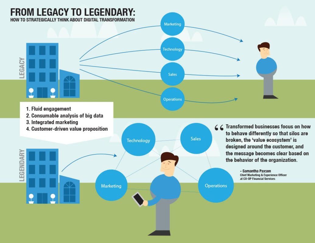
I’ve recently been hired to create some infographics for writers to place with their articles. Here’s an example for Entrepreneur Magazine.

The article is centered around transforming a business from a “legacy organization” to a “legendary organization” and the updating of strategic thinking to keep up with technology and online communities of today.

Infographics, as a general rule, should be simple and easy to follow in terms of message. They’re a quick visual summary of a bigger picture (so to speak) and should communicate the larger concepts in succinct graphic representations. Style is not necessarily predetermined, and a designer has certain freedoms in that regard.

Web Design Trends

Web Design Trends

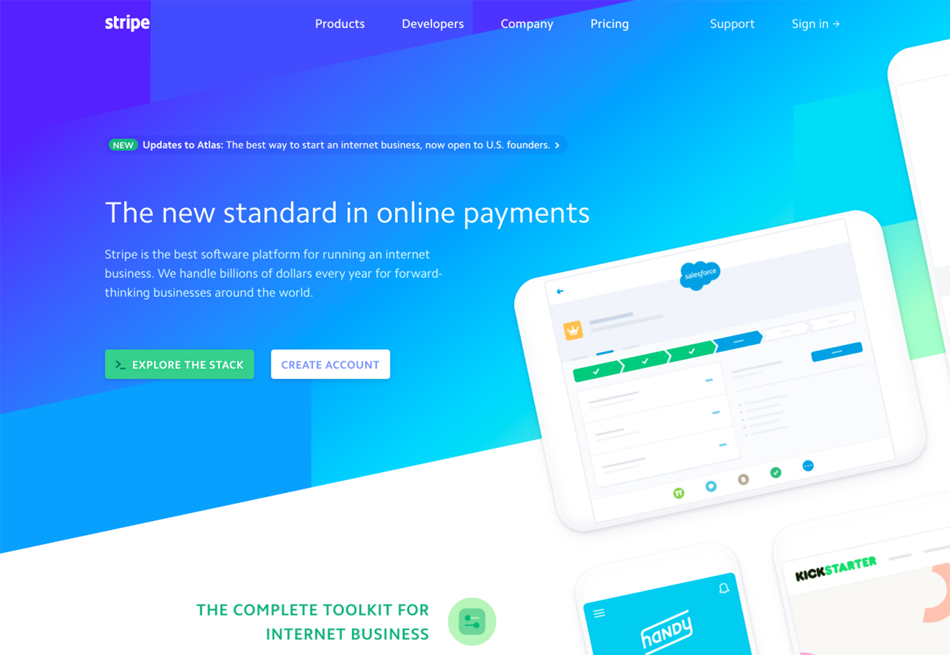
Websites follow trends all the time. A while ago it was hard to find a website that didn’t have some kind of Flash animation. That went the way of the Dodo pretty fast as technology caught up and mobile companies refused to integrate flash players on devices. We also saw the seemingly meteoric rise of do-it-yourself websites based on templates, and the use of WordPress with better and better themes as the years passed. From a design standpoint, form usually followed function, as well as how easily it could be integrated.

Here are some of the trends that are we’re seeing now in the web design world.

Header layouts

Whereas the trend in the past has been to have an almost full screen slider at the top of your design,

Photography and why it’s important

Photography and why it’s important

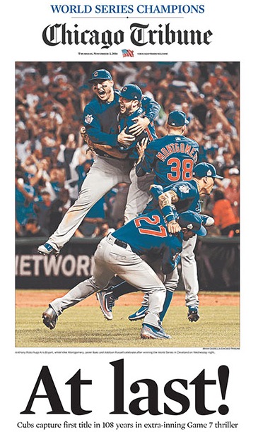
After 108 years of the curse of the goat, the Chicago Cubs won the World Series in a thrilling extra innings Game 7 showdown with the Cleveland Indians. It finally happened. I was at a pub in Los Angeles and witnessed grown men crying with joy and relief after the final out secured a historical win for the Cubbies.

The following day, an interesting thing happened. The Chicago Sun Times and the Chicago Tribune published cover stories with photos capturing the euphoria of the moment the Cubs players rushed out onto the field. There was a very notable difference between the two shots.

The Sun-Times (8th largest paper in the US by circulation) laid off its entire staff of photographers back in 2013 and then sent a memo to its reporters about training them in iPhone photography.

Using the Right Social Media Language

Using the Right Social Media Language

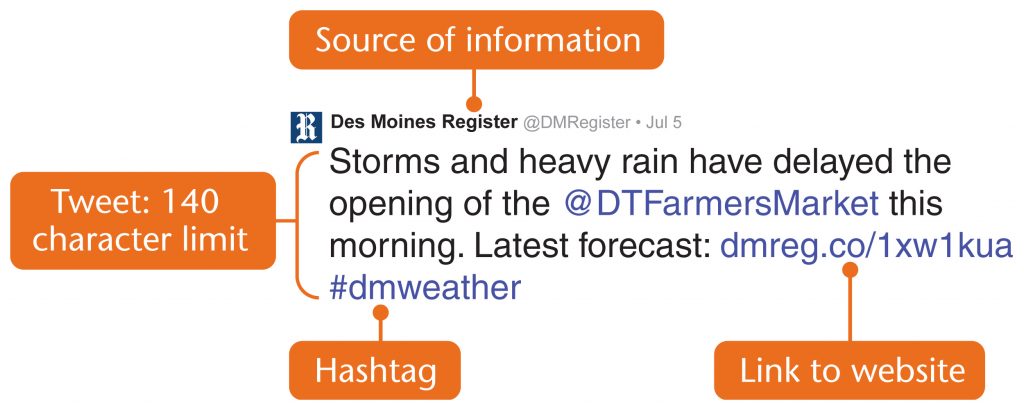
I wrote a guest blog for proactivereport.com about the language / shorthand of social media and using the right language for each platform.

Here’s an excerpt:

Social media has become the elephant in the room when it comes to business nowadays. Either you’re using it effectively, or you may as well not be using it at all. Many young folk assume that they because they know how to use it for personal interaction with friends they can do it effectively for a brand and build a community of engaged and loyal customers. That’s a different kettle of fish entirely.

Social media today is about visual storytelling and each platform has developed its own shorthand,

Eye of the beholder: Visual Content and your brand

Eye of the beholder: Visual Content and your brand

Social media has become a melting pot of white noise. For your brand to penetrate that noise and actually make any meaningful contact with your intended audience, you have to be ahead of the pack these days.

And being ahead of the pack, in no small way, means that your content needs to be visually engaging. Our news feeds and facebook walls are overflowing with what people did for lunch today or how tasty their grandma’s apple pie was or how much they love pizza and rosé wine, or how they “literally can’t even” – whatever that means, it’s become a battle for attention.

Visual content is no longer just a good idea,

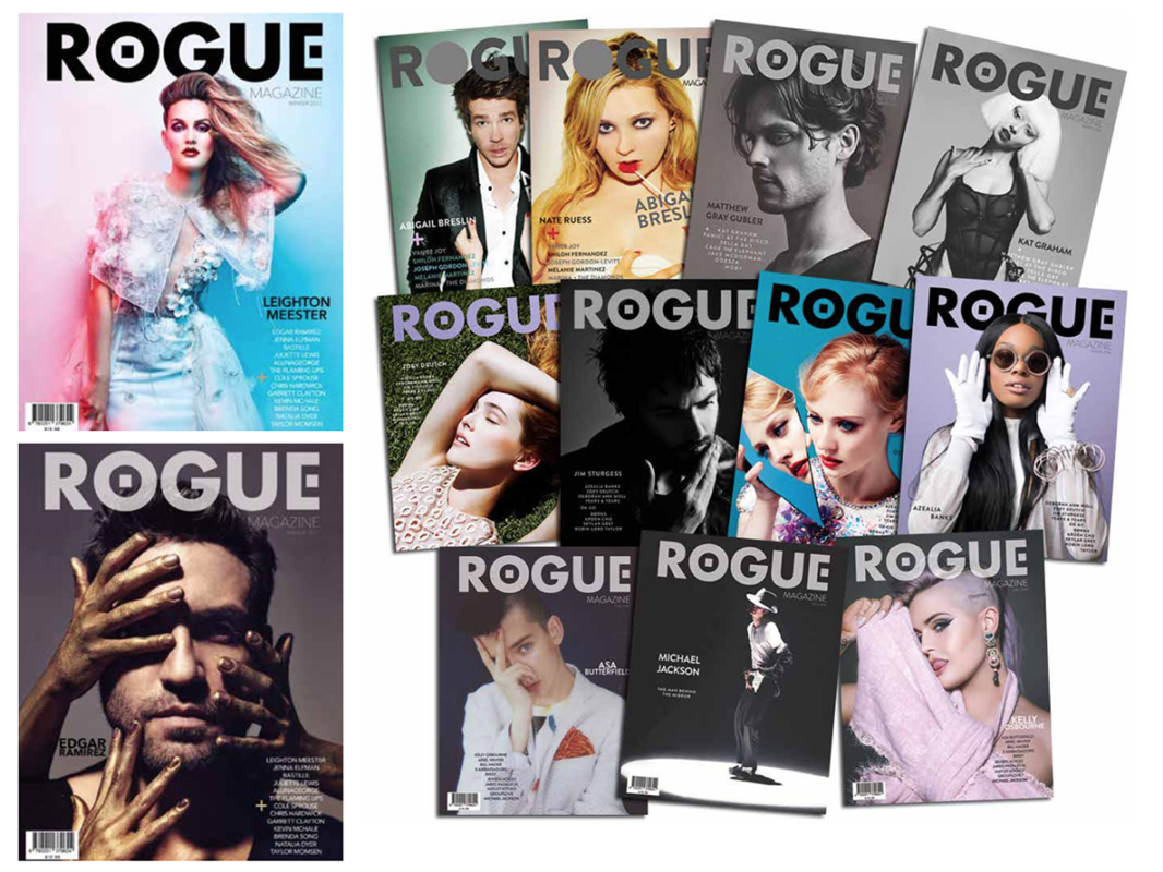
Rogue Magazine

Rogue Magazine

After some time of being away from magazine design, an opportunity came my way to work as Art Director on Rogue Magazine.

I jumped at the chance because it’s been a while, and I really do enjoy working in that format. The last job I had in publishing was in South Africa, working for a nationwide magazine.

I have to say, I’m really proud of the work and hope people enjoy it. It’s a very cool mag. You can find issues of the magazine here >> www.theroguemag.com/shop