Responsive Design

I think it was Bill Gates who said some years ago, “In the future there will be two kinds of companies. One with an effective website, and one with no business at all.”

Okay, so maybe it wasn’t Bill Gates, and maybe I totally paraphrased that “quote”. But you get the idea.

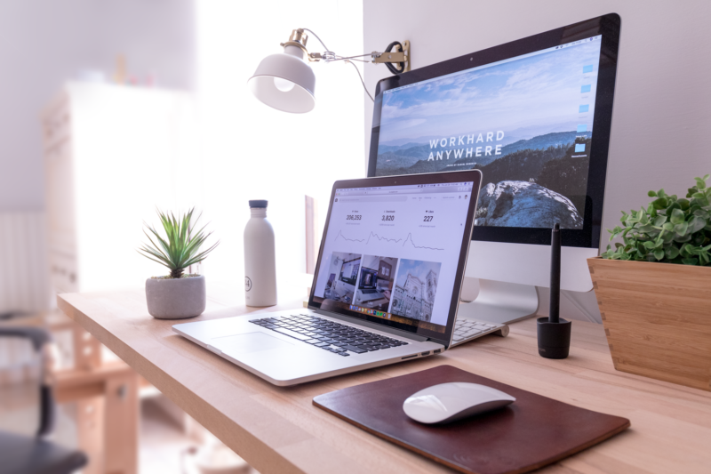
In web developer speak, a “Responsive design” is a website that is designed to change its layout, depending what device you view it on. In other words, it responds to its environment.

So, if you view a responsive website on a computer (laptop / PC) you’ll see it in its “normal” layout.
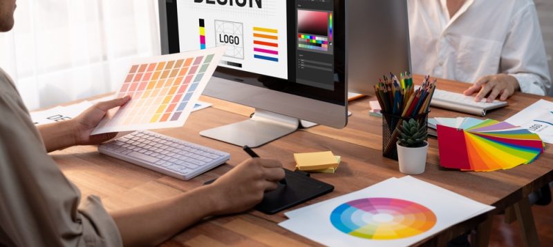
A history of Photoshop

I found this blog entry on springleap.com and thought it was worth sharing:

The history of Photoshop is the story of modern graphic design. For many designers, a world without Photoshop seems like ancient history. But it’s important to remember that until 1990, the majority of designers still made use of Letraset hand lettering and photomanipulation meant exactly that. Designers had to physically manipulate photographs using a variety of techniques such as airbrushing, painting, cutting and pasting (many of which now make up tools in Photoshop). At the time Photoshop was first released, many designers continued to use traditional techniques, until adopting Photoshop in later versions,

Visual content and Facebook

As a designer I constantly pay attention to visuals and they affect content. There has been a recent move to focus more and more on visual content in social media. Facebook purchasing Instagram was just one example. And it makes sense if you think about it. When looking down your twitter or facebook feed, what catches your attention? Photos and images, right?

Photos on Facebook get 53% more likes and 104% more comments than a text post. Posts that include a photo get 120% more engagement than the average post. If you add a photo album this jumps to 180%.

For business this means missed opportunities.

Inner beauty

You’ve no doubt heard a version of the phrase “You are your own worst critic.” Dove soaps capitalized on that concept with a beautifully executed campaign. Ogilvy & Mather Agency hired a forensic sketch artist to illustrate that fact and give some insight into how we view ourselves.

Typography

Believe it or not, it’s not as simple as just picking a font and hoping for the best. I’ve worked with some of the most meticulous and experienced type setters around, and there is a definite science to the art of typography. Treating type like an object of design (as opposed to treating it like words on a page) is essential when approaching the subject.

There are many things that go into the creation of a simple, yet beautiful design and one of the most important factors is text. Leading, kerning, font choice, font size, relative size to other objects, alignment, color pallet … all these things determine the ultimate result.

The IdeaLists

I recently came across this website that is a fabulous resource for freelancers and creatives looking for high quality, well-paid projects. I’ve done the rounds in the online community and have at one time or another had profiles on various websites to boost the numbers of incoming gigs. But my general experience was that the projects went something like this: “We need someone to design our website, oh, and our logo… and all of our branding … and print collateral. 6 Months work. Budget: $500”

In other words, the quality of work was less than desirable, and the budgets were mostly small or non-existent. Not so with theidealists.com.

A nice compliment

I was having a discussion with a vendor today that I work with quite often and use as a resource for programming on web projects. He said the following to me, “You are one of the best designers I’ve ever worked with, and I’ve been working in this industry for about 20 years. You’re in the top percent of guys out there in terms of your design skill and attention to detail.” Not to toot my own horn or anything, but that was a really nice compliment.

About Mike Falkow

I thought I’d post a little something about me so anyone who was interested could get an idea of my training and background. I was born and raised in South Africa. After graduating high school with a focus on fine arts as my choice of studies, I enrolled in a newly emerging multimedia program with MediaTek Training Institute. Graphic Design and Desktop Publishing were the major subjects covered and after completing the program I was hired by a major magazine as junior designer. After being there for a year, and climbing the ranks to senior designer of one of their publications, I left the company and travelled Europe, Asia and the United States for a couple years.