The anatomy of a logo
It’s an election year coming up in 2016 and the campaigns have already begun (sort of). I came across this article about Hillary Clinton’s logo and it got me thinking.
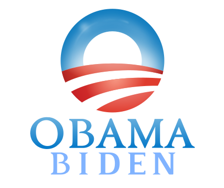
I’ve seen some excellent, very “politically appropriate” logos out there before. They tend to not stray very far from the basic, capitalized, serif font, red, white and blue color scheme. Solid. Reliable. Trustworthy… All the things you want the public to have the impression of when you’re running for a government position.
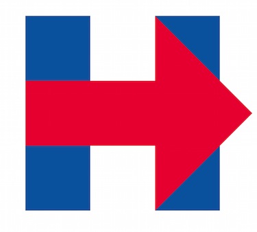
Ok so here’s Hillary’s new logo:
It reminds me of something that I wrote in another post about the basics of design. Read the full article here: www.21towinmedia.com/what-makes-good-design/
Color is essential to good design, but more importantly, the use of combinations of colors. There are scientific reasons behind this. Light refractions and combinations of lights and optic illusions can result from the wrong combinations of colors vibrating against one another. Ever look at a block of blue over a block of red? Or visa versa? They literally vibrate, one color against the next and has a tendency to agitate the eye of the beholder. On the other hand, colors have their palettes in which they thrive and compliment one another. A good design always uses the right combination of colors which compliment one another.

Look familiar?
As far as the actual “shape” of the logo. I get it. I mean. “Forward progress” is the key message. Right? Seems easy enough to me. But anyone who’s seen the Fedex Logo will probably have this nagging thought in the back of their mind… “Where have I seen that before? I feel like I need to have a package delivered for some reason.”

See the arrow in between the E and the X? Personally I think the Fedex logo is genius. It’s subtle, and you don’t immediately see the arrow. Hillary’s on the other hand, well, not quite so subtle.
Anyway. I’m not here to bash the handiwork of another designer. But seeing the article on her new logo did get me thinking, and so I thought I’d share those thoughts with anyone who’s interested, and use it as an example to perfectly illustrate my point about color combinations above.
